
The story behind the Isaivu logo


Saruja said something on our first call. It never made it into a moodboard. But it became the whole idea for the logo.
I asked what she wants people to feel when they wear her clothes. She did not say luxury. She did not say elegant. She said she wants Isaivu itself to feel like a hug  Isaivu means comfort in Tamil. Her belief is simple. Clothes should not make you shrink to fit them. Clothes should fit you. But there is more to it than comfort. She also believes in buying fewer, better clothes and wearing them again and again, instead of chasing trends. That is where sustainability quietly becomes the other half of the brand.
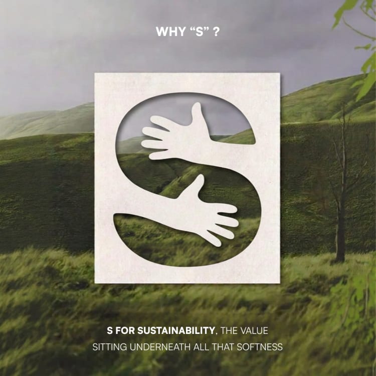
So the logo had to hold both ideas at once. Two hands come together to form the shape of an S. Look at it one way, and it is a hug. Look at it another way, and the S stands for sustainability, the value sitting underneath all that softness
Isaivu means comfort in Tamil. Her belief is simple. Clothes should not make you shrink to fit them. Clothes should fit you. But there is more to it than comfort. She also believes in buying fewer, better clothes and wearing them again and again, instead of chasing trends. That is where sustainability quietly becomes the other half of the brand.
So the logo had to hold both ideas at once. Two hands come together to form the shape of an S. Look at it one way, and it is a hug. Look at it another way, and the S stands for sustainability, the value sitting underneath all that softness  One shape, doing two jobs, because the brand only makes sense when both ideas are true together.
We placed the same hand inside the wordmark too. It sits tucked inside the small s in Isaivu. So the hug shows up twice, but it never feels repeated.
A logo does not need to explain a brand. It just needs to already feel like what the brand believes.
Brand identity for Isaivu, a sustainable comfort wear label. They design sarees, blouses, and luxury wear made to fit the body, not the other way around.
#logodesign
One shape, doing two jobs, because the brand only makes sense when both ideas are true together.
We placed the same hand inside the wordmark too. It sits tucked inside the small s in Isaivu. So the hug shows up twice, but it never feels repeated.
A logo does not need to explain a brand. It just needs to already feel like what the brand believes.
Brand identity for Isaivu, a sustainable comfort wear label. They design sarees, blouses, and luxury wear made to fit the body, not the other way around.
#logodesign