
DocLynk app: the UI UX design behind it

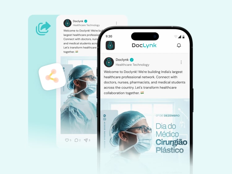

DocLynk is live on Android, iOS, and web. It is a professional network built specifically for doctors, for connecting with other clinicians, sharing medical content, and finding clinical job openings. I worked as the UI and UX designer on the DocLynk app, the web app, and the super admin panel behind it. The marketing website is separate, already built by the client before I came onto the product itself. One naming decision took more testing than most screens in the app. The original plan was to call the connect action Link, since DocLynk's core idea is linking doctors to each other. That word caused a real problem early on. People read Link and assumed it meant a shareable link to their profile, not the action of connecting with someone. So the button became Lynk instead, spelled the way the brand already spells it. Tested with a handful of random users, and it read correctly without needing an explanation the way Link did. That naming choice came out of usability testing, not a single design pass. Multiple rounds, watching where people hesitated or tapped the wrong thing, adjusting the wording and flow, then testing again. DocLynk has just gone live, so there are no numbers to share yet. This post is about the design work that got it there, not a results update. A longer breakdown of the actual product decisions is coming as a full case study. https://www.doclynk.in/ #liveprojects #uiuxdesign