
Logo design for a family construction firm

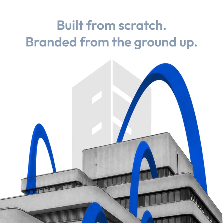

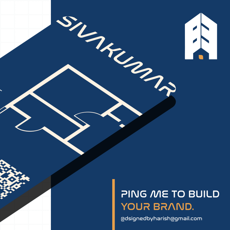
A friend from school runs a construction business his father built. Years of real work, real houses, real trust in the area. No logo. No business card. No way to find them online.
He wanted to scale it, but reputation alone only carries a business so far. He needed something people could actually recognise and hand to someone else.
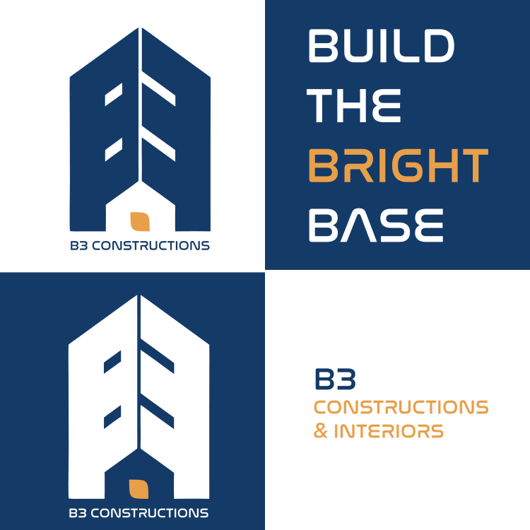
The name gave me the mark before I even started sketching seriously. B3 Constructions and Interiors, and their own tagline was Build the Bright Base. Three words, three B's. B3 was already spelled out in their own language, I just had to draw it.
So the mark is one shape read two ways at once. The left half forms a B, the right half forms a 3, sitting side by side the way the name is actually said. Between them, in the negative space at the base, sits the silhouette of a small residential home, since houses are the real work. The orange inside that home is not just an accent colour, it stands for interiors specifically, since residential construction and interior design are where B3 is focused right now.
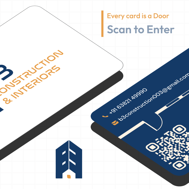
A home has a door, so that's where the business card idea came from too. Every card is a door, scan to enter, with a QR that opens straight into a whatsapp chat, the map location, or the website, depending on where someone needs to go next  A generic logo would have worked fine for a directory listing. This one had to work for a son carrying his father's name into rooms his father never got to walk into.
#logodesign
A generic logo would have worked fine for a directory listing. This one had to work for a son carrying his father's name into rooms his father never got to walk into.
#logodesign