
Logo design for a livestock and agro farm

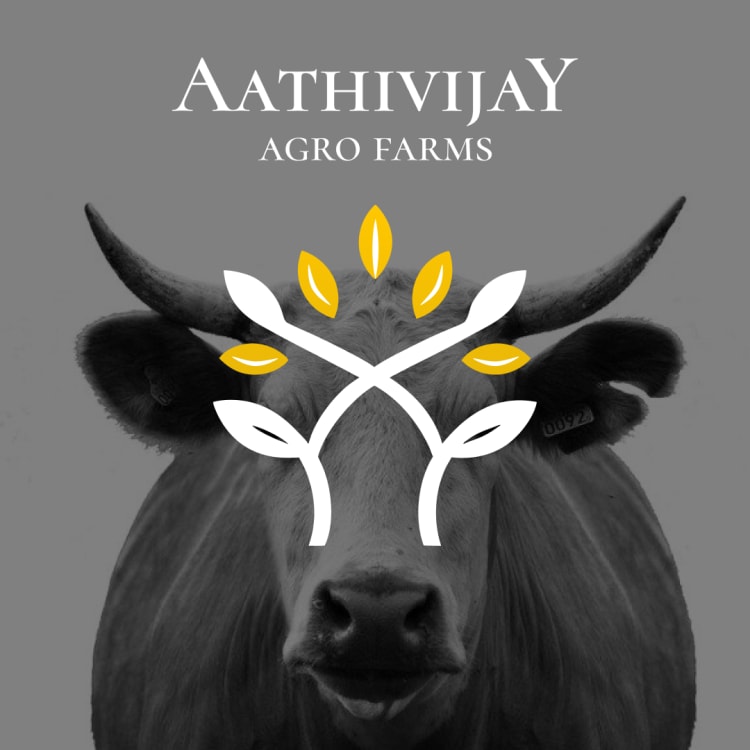
Aathivijay Agro Farms sits in an odd space. Part livestock, part crop farming, and most logos in that industry just pick one side and ignore the other.
So the mark had to hold both without gluing two separate symbols together. The curved white lines double as leaves and as the shape of cattle horns, crossing at the centre so neither reading sits on top of the other.
Two mustard leaves sit as accents on either side, with six white leaves built into a symmetrical layout. A farm business like this runs on trust built over years, not on flash, and symmetry does not shout, it just sits there and feels correct  The serif typeface carries the same idea. It reads as established rather than new, which matters more here than looking trendy would.
Placed over the actual animal's face rather than a plain mockup, the mark earns its own concept honestly, livestock and agriculture sitting in the same image it is trying to describe.
A business with two identities does not need two symbols. It needs one shape patient enough to be both at once.
#logodesign
The serif typeface carries the same idea. It reads as established rather than new, which matters more here than looking trendy would.
Placed over the actual animal's face rather than a plain mockup, the mark earns its own concept honestly, livestock and agriculture sitting in the same image it is trying to describe.
A business with two identities does not need two symbols. It needs one shape patient enough to be both at once.
#logodesign